3D Search: Have you ever imagined what it might be like to search in 3D?
A list of text is the traditional model
We tend to accept and assume that the way we search, whether its on the internet browser, at work or on our own laptop, is the way it is meant to be. We use words (i.e., search terms) and get the results in the form of a textual list (or sometimes as icons). We have got very used to handling lists of data but they are not easy to assimilate. They require effort to read and understand. Also, text is very one dimensional. A list of search results on a page are all related to the search terms we have used but they all have differences. The words represent far more than the list of characters they comprise.
But of course it doesn’t have to be that way. In future things might be different. Perhaps you want to see your results grouped into emotions (Love, anger, happy, sad etc) or it might be nice to have them separated into categories, concepts or genres. Perhaps they can be displayed in a way that helps us understand the relative abundance or similarity of results. These extra features enrich our experience and allow us to eliminate unwanted results quickly. We see some of these things when we buy books or music but it hasn’t percolated into our everyday experience yet.
So what about 3D Search and what do we mean by 3D?
Our search engines give us multiple pages of results but we don’t often go beyond page two without changing our search terms. Imagine instead that the search results are grouped together based on how closely they are related to each other. So results that might ordinarily appear on page 1, 3 and 5 are shown close together because they are closely related. If that were possible, how might you display that relatedness?
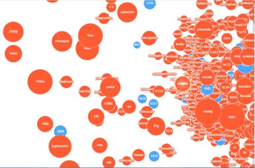
Some of us are used to seeing network diagrams. These use nodes to represent “things” and connectors to represent the relationships between them. Imagine a network diagram, visualised in such a manner, that it was possible to explore it in 3D.

As an exploration of the possibilities, Symilarity created this demonstration visualisation. It was built using data from biomedical patent applications processed by Symilarity’s Helix Insight Engine product. It has two sets of nodes, one representing documents and one representing search terms. The proximity of the nodes represents the relatedness of the data, with the size of the nodes representing the number of documents or terms that are clustered together. Whilst the user interface only serves to run the visualisation, you will get a sense of the way it might work.
What becomes immediately obvious is the differences in proximity helps us understand the relative closeness of items to the search term. The way terms or documents are clustered together helps us recognise their close relationship with each other. Also, colour helps with the assimilation process. Here colour differentiates between documents and terms (words). The experience is an immersive one and great for both browsing the data and focusing upon a particular part of the data. A picture paints a thousand words as the old saying goes.
Clearly there are some drawbacks to this approach. You can imagine searching in this way might take more time, because there are more results to see and navigate. Also because it is in 3D and you can move inside the search results, inevitably there is data outside your field of view. The result you are looking for might be right behind you or just obscured by the object in front of you.
Here at Symilarity, we believe the future of search and search visualisation will include techniques that make it easier to assimilate and navigate the results. All the potential options rely upon us enriching our data with additional attributes that can be used to group our results in different ways. Whilst you might not want to use this type of 3D search to find your nearest cappuccino, it might be used to detect major criminal gangs or identify the candidate drugs for new disease treatments.
